Arushi Week 9 - There's More Than Meets the Eye
Blue is supposed to make you feel relaxed. Orange is supposed to help students focus. Red is reminiscent of vibrant passion and fury. Over millennia, society has assigned different values to different colors (e.g. innocence to white, fortune to green, mystery to black) as well as varying degrees of power to the six primary pigments.
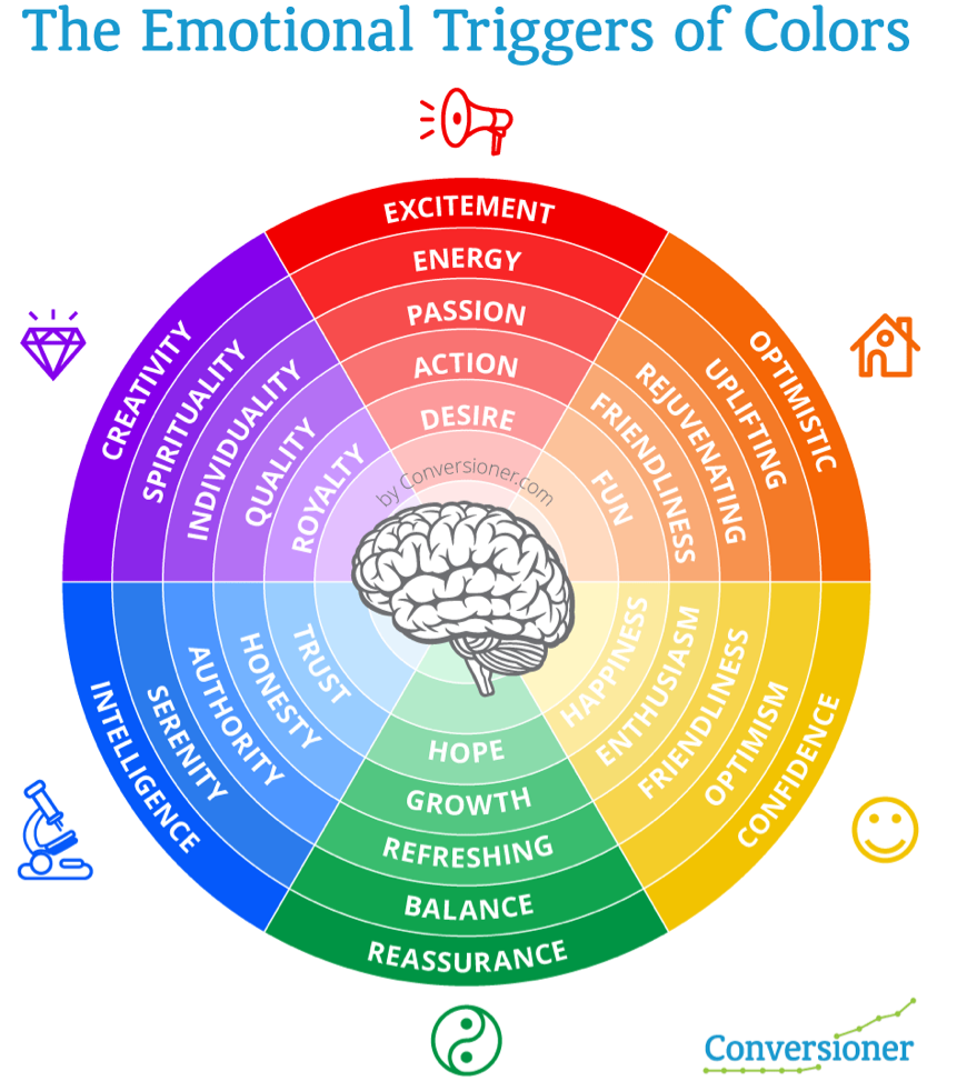
Color psychology was founded in the 17th century and was based on Isaac Newton's discoveries related to the color spectrum. Many psychologists believe that colors can draw reactions from people based on their hue. There are two primary ways colors can influence people: emotionally and behaviorally. Each color possesses the ability to incite emotions and bring back specific memories. For example, colors like red, orange, and yellow, warm-toned colors, share the ability of evoking feelings of fervor, energy, and vitality whereas cool-toned colors like blue and green convey a sense of tranquility, balance, and wisdom.
Where color psychology comes into play is when people use specific colors in their daily life in a calculated manner to elicit a particular response they want from another person. Strategically using colors for art, branding, and self-image can help anyone gain a slight upper hand in most situations. Now obviously, wearing blue might not make someone else accept all your opinions because they feel that you are extremely wise, but it certainly has the potential to ensure that your conversation will be peaceful.
The use of color psychology is much more common in the realm of marketing than in that of interpersonal communication. Every year, a certain color gains popularity - many companies incorporate this color in their products as many people consider the appearance of an item's packaging a deciding factor while making a purchase. Last year, sage green took the markets by storm, so much as to influence several renowned designer brands to change their typically temporary color schemes to indefinitely accommodate this new shade of green because of the associated sales.


Hi Arushi! I thoroughly enjoyed your blog about the role of color theory in our everyday lives. Over the past couple of years, I have taken an interest in logo designing and marketing so I often research the effect of certain colors on the human psyche. You mentioned that colors would be used in a “calculated manner” which becomes more obvious when looking at the logos of popular brands. For example, medical organizations like Kaiser Permanente and Sutter Health use rich shades of blue to convey a comforting and safe feeling. Hospitals also use plus symbols or a sign of people coming together to further convey these warm feelings. Similarly, organizations that promote planting trees and protecting forests like the Arbor Day Foundation and Plant a Billion Trees use various shades of green to create an earthy look. Creative and peppy ideas like Barbie, Hallmark and Taco Bell use bright purple and pink colors to excite the viewer. Well-developed, professional companies stick with neutral whites and grays like Apple, Nike, Puma and The New York Times. These hints of the power of color are all around us so I am extremely happy that you highlighted this in your blog.
ReplyDeleteOne thing that I was surprised to discover through your blog was the popularity of sage green in companies over the past year. It is interesting how many made variations of their logos with this color to increase their sales and profits. I wonder what the new color will be for 2024 and how that will impact various companies. Based on the coquette trend, I predict that color will be pink. I also wonder if there is some way to predict the popularity of certain colors for the future by analyzing data from the past couple of years.
Overall, I truly enjoyed reading his blog as it is a topic I often think about. Hopefully, we can have a conversation about color theory soon and maybe even discuss how to use it in our logo and merch design for our robotics team!
Hi Arushi! I truly learned so much about color from your blog! I’ve always found color psychology so fascinating; the fact that color can change how others view a person is incredible. Your introduction immediately intrigued me, and the brief history about the beginnings of color psychology is a great way to start your blog. I never knew that Isaac Newton’s discoveries helped with the development of color psychology, as I’ve always connected him to physics. I like how you add specific examples of how certain colors, such as red and blue, can evoke certain emotions and feelings. When looking at blue and green, especially in nature, I can definitely feel a sense of relaxation and peace. At the end of your blog, I like that you included an example of how color psychology is used today in companies. Color is definitely a powerful tool in marketing as fast-food restaurants often use red in their logos to incite hunger. I need to pay more attention to colors now, especially in my wardrobe!
ReplyDeleteI thought your blog title was especially well-chosen and it immediately grabbed my attention. I found it interesting to learn that colors can have such a meaningful impact on people, which, as you mentioned, companies can leverage to increase their sales. I wonder how this came to be. Could it be biological? Did humans evolve to perceive specific colors in certain ways? Could it be learned? Have we subconsciously drawn connections between the use of certain colors? I personally think that it could be a combination of both. For example, the color green is often associated with money, which is obviously a result of money being green in our environment and not evolutionary. I also wonder whether this could differ from person to person. Back to the example about money, money is not green in all countries. Therefore, it is not necessary that all people associate the color green with money. Overall, I thought your article was really interesting and informative. I liked how you had a vivid illustration of the specific emotional triggers of colors in your blog and how you incorporated various examples of the effects specific colors could have on us in our everyday lives.
ReplyDeleteArushi,
ReplyDeleteI thought that the topic you chose for this blog was very unique and interesting! I believe that in our day to day lives we subconsciously notice different colors on different people and objects, and this certainly holds a great power over us! Additonally, your instance of how color psychology is "common in the realm of marketing" was really eye-opening because sometimes we overlook the specific color palette different brands use, and this certainly plays a great role in how eye-catching a brand might seem to us. Overall, your blog was very insightful and provided vivid detail on how the color wheel can determine our emotions and behavior.